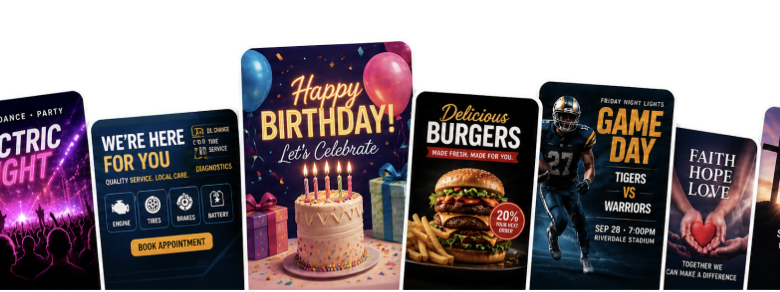
A local business promoting a workshop may need an Instagram post, an email graphic, and a printed handout for the counter. Each version needs the same date, price, and booking details, even though the layouts differ. For a small marketing team, preparing those versions can take several rounds of design work.
AI flyer generators give teams another way to develop the initial layout and request revisions. A written brief describes the campaign, reference images supply visual guidance, and follow-up instructions help refine the draft. The practical question is how to fit those steps into a process that still produces accurate, usable marketing material.
Consider Harbor Lane Bakery, a fictional business planning a holiday cupcake workshop. Its campaign provides a simple example of the decisions a team needs to make. The product screenshots below illustrate the interface separately; they are not results from the bakery example.
How Prompts and Reference Images Guide the Design
A prompt tells the system what the flyer should communicate: the offer, audience, required wording, and visual direction. Reference images add information that is harder to describe, such as the appearance of a product or the composition of a previous campaign.
These inputs can guide generation, but they do not lock every element in place. When a tool returns a finished image, the lettering and logo may be part of that image rather than separate, editable objects. A request to move the date can therefore work differently from moving a text box in a conventional design editor.
This matters when choosing a workflow. A team exploring campaign ideas can give the generator room to vary the composition. A team preparing a flyer with tightly specified typography or exact logo placement may need a layout editor to finish the file.
Prepare the Campaign Details Before Generating
For the bakery, “make a warm Christmas flyer” is a starting point, but it leaves the system to guess most of the content. A useful brief includes the copy that must appear:
- Holiday Cupcake Workshop
- December 14 at 2:00 p.m.
- $35 per person
- Parents and children welcome
- The venue address and booking URL
- The call to action “Reserve Your Spot”
The team can then describe the design: a cream background, deep red accents, decorated cupcakes as the main image, and clear space around the bakery logo. It should also specify the intended format, such as a 4:5 social feed image, and check the exported dimensions before use.
Separating the required copy from the visual instructions makes later review easier. The team can judge whether it likes the layout while checking the wording against one approved source. If a price changes, that source should be updated before any new versions are made.
Use Brand References With a Clear Purpose
Each uploaded file should have an explained role. A product photograph might be the main subject. A previous flyer might serve only as a color reference. Without that distinction, a system may carry over details the new campaign does not need.
In the bakery example, the team could provide its logo, a photograph of the cupcakes, and a previous holiday flyer. It could ask to feature the cupcakes, follow the earlier color palette, and omit the old event details.
For a concrete product example, Vismuse supports a chat workflow in which users describe a design and request changes in words. Its AI flyer generator accepts a written brief along with a logo, photo, or other reference image. This gives a marketer a way to communicate the campaign without arranging every element manually.
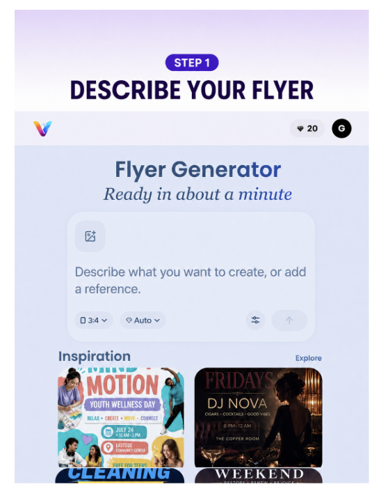
Product example: the mobile prompt field and inspiration gallery. Image supplied by Vismuse.
References still need checking in the result. Compare the generated logo with the approved artwork and look for changes to product details. If the logo must be exact, use the original asset in the final layout.
Choose a Layout Before Refining the Details
The first round should help the team choose a composition. For the same workshop brief, it could request one version with a large cupcake photograph and another with a prominent event title. Those alternatives give the reviewer a meaningful choice.
Look at both at the size a customer will see them. Can someone identify the event and find the date without zooming in? Is the booking action obvious? A layout that needs a long explanation is unlikely to work well in a busy social feed.
Once a direction is chosen, make specific revisions. “Move the date above the booking line” is easier to evaluate than “make it better.” Asking for one or two changes at a time also makes unintended changes easier to spot.
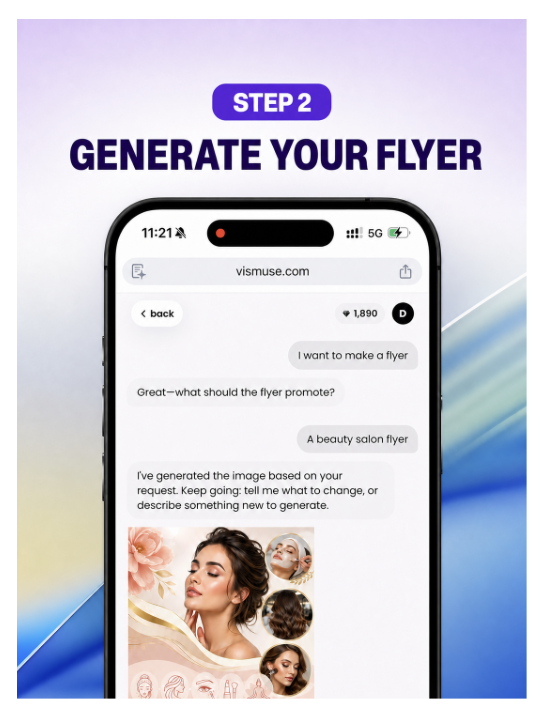
Product example: a beauty salon flyer displayed in the chat. This is a separate demonstration, not the bakery campaign. Image supplied by Vismuse.
For Harbor Lane Bakery, the team might choose the cupcake photograph, remove decoration behind the price, and enlarge the workshop title. After each revision, it should recheck the fixed copy as well as the requested change.
Adapt the Approved Design for Each Channel
A social feed image, a vertical story, and a printed handout need different layouts. Simply stretching or cropping one file can cut off information or leave the type too small.
Use the approved design as a reference for each new format, and state what must remain: the event copy, logo, colors, and main image. Review the new composition on its own. A date that was easy to read in the original may become hard to find after the image has been rearranged.
For print, ask the printer for the required dimensions, resolution, bleed, and file format. A PDF export alone does not establish that a flyer is ready for production. The exported file still needs to match the printer’s specifications.
Review the Final Files Against the Brief
Before publishing, compare every version with the approved campaign details. One person should be responsible for signing off the files.
- Copy and links: Check the event name, date, time, price, venue, and booking URL. Test any QR code in the final file.
- Brand assets: Compare the logo and product imagery with the originals.
- Readability: Preview at the intended viewing size. Check that text stays clear against photographs and decorative backgrounds.
- Cropping and output: Keep essential information away from trim edges and platform overlays. Confirm dimensions and format for each destination.
- Permissions and claims: Confirm that uploaded images are cleared for use and that the flyer accurately represents the offer.
For digital text, the W3C contrast guidance provides a useful benchmark: at least 4.5:1 for regular text and 3:1 for large text. Contrast is one part of readability; type size and a clear layout also matter.
After publication, keep the approved brief, source assets, and final files together. When the next workshop needs a new date or price, the team has a checked version to start from and a record of what needs updating.