
A team ships a new ranking model. Relevance improves by 0.6 percentage points. Coverage breadth drops by 0.4 percentage points, from 94% to 93.6% of the catalog. Both numbers are visible, neither is clearly good or bad.
The team debates for two weeks. Some argue the relevance gain matters more. Others point out that lower coverage means fewer products with recommendations at all, and the affected users never see the relevance improvement.
There is no framework for resolving the disagreement. The team ships based on a judgment call from the most senior person in the room.
Three weeks later, the coverage regression turns out to be concentrated in a specific product category. Users in that category are seeing empty results. The relevance improvement is real but concentrated in categories that were already well served. The net effect is negative, but that conclusion was not reachable from either metric alone.
Both metrics were accurate. The problem was that the team had two numbers, no defined relationship between them, and no principled way to decide. I run a system that processes hundreds of millions of decisions per year, and I have been on both sides of this: the side that shipped without defining the trade-off, and the side that caught the regression too late.
Why single metrics lose information
The standard approach is to pick a primary metric, optimize it, and treat everything else as a guardrail or an afterthought. This works when the primary metric genuinely captures what matters. It breaks when the system serves multiple goals in tension with each other, which in production is almost always the case.
A ranking system needs relevance and coverage. A recommendation system needs precision and diversity. A search system needs accuracy and speed.
These pairs are not independent. Improving one often costs the other, and the cost depends on the segment, the use case, and how much of each dimension you already have.
Any single metric is a projection. It takes a multi-dimensional outcome and collapses it onto one axis. The information lost in that collapse is where regressions hide.
Surveys on multi-objective recommender systems (Jannach and Abdollahpouri, 2023) confirm that accuracy and at least one beyond-accuracy metric are typically in a trade-off relationship. That matches what I have seen in practice.
I have been in rooms where the secondary data existed, was visible on a dashboard, and nobody used it in the ship decision. Not because the team was negligent, but because there was no established practice for incorporating it.
What two views of coverage taught me
We were evaluating coverage for a recommendation system. The obvious metric was percentage of anchor products that have at least one recommendation. By that measure, coverage looked strong.
But we started also tracking average number of recommendations per anchor product. Same system, same data, different projection. Products in popular categories had deep recommendation pools. Products in sparse categories had one or two recommendations, sometimes marginal ones.
The percentage metric said coverage was good because those products technically had a recommendation. The depth metric said the quality and variety in those categories was not useful to the user.
If we had only tracked the percentage metric, we would have concluded coverage was healthy and moved on. The depth metric revealed that a significant portion of the catalog was technically covered but practically underserved.
Both metrics were accurate. They were measuring different projections of the same reality. What to do about it depended on how those projections related to each other, and that question could not be answered by either number in isolation.
Why single metrics persist anyway
Simplicity is the biggest reason. A single success criterion makes the ship decision binary: did the number go up? Multi-dimensional criteria require judgment calls, and judgment calls require context.
Tooling is the second. Most experimentation platforms are designed around a primary metric and a few guardrails, not trade-off surfaces.
Incentive structure is the third. A 0.5% improvement is easy to communicate in a review. A trade-off analysis is harder to summarize in one sentence.
I understand why single-metric optimization is the default. I have worked in that mode. It is faster on any individual experiment. It just accumulates costs that show up later.
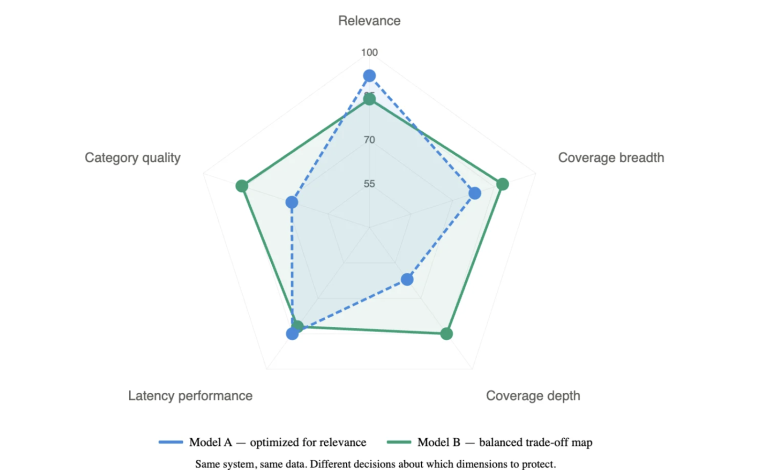
The trade-off map
The coverage example was not an isolated case. After enough experiments where the multi-metric picture changed the decision, I started formalizing the practice. I think of it as a trade-off map: a document the team produces during experiment design that makes four things explicit.
First, the dimensions. For the system I operate, these are relevance, coverage breadth, coverage depth, latency, and quality on specific product categories. Five dimensions. When we optimize one at the expense of another, we want that to be a deliberate choice, not something we discover after shipping.
Second, the guardrails, with numbers. Not “we will keep an eye on coverage” but specific thresholds: if coverage breadth drops below 92%, we pause. If average depth in the bottom quartile of categories falls below 3, we pause.
If p99 latency exceeds budget by more than 15%, we roll back. Written down before launch.
Third, the trade-off ratios. In multi-objective optimization, the set of solutions where no dimension can be improved without degrading another is called the Pareto frontier. We do not compute it formally. We decide, for each experiment, where on that frontier we are willing to operate.
We write these as conditional statements: “a coverage breadth regression up to 0.3 percentage points is acceptable if distributed uniformly across categories, verified by checking category-level confidence intervals; a regression of any size concentrated in the bottom quartile is not acceptable regardless of relevance gain.”
Fourth, the monitoring plan. Which dimensions get checked, at what cadence, by whom.
To revisit the opening example: if that team had built a trade-off map, the map would have specified that a 0.4 percentage point coverage regression was acceptable only if uniform across categories. The data showed it was concentrated. The decision would have taken a day, not two weeks, and it would have been the right one.
What actually changes
The most noticeable effect is speed. When the map exists before the data arrives, the data either falls within the acceptable region or it does not. Debates about whether to ship become shorter because the boundaries were set when the team was thinking clearly, not under pressure to make a launch decision.
The less obvious effect is that we have started building institutional knowledge about our own system. Every map records what we believed about the relationships between dimensions at the time. Over time, we have learned where trade-offs are binding, meaning improvements on one dimension come at a real cost to another, and where there is room to improve multiple dimensions simultaneously.
Our guardrails have gotten more precise. Our trade-off ratios have gotten more calibrated. The first map we built was rough. The most recent ones are substantially better, built on real evidence about what the acceptable boundaries actually are.
The honest cost
Defining trade-off surfaces adds work to experiment design. It requires conversations that are easier to skip. It has meant not shipping changes that looked good on a single metric.
There is also a statistical cost. Monitoring five dimensions with guardrails increases the probability of at least one false alarm triggering a pause. We have had to calibrate our thresholds against the overhead of unnecessary investigations, not just statistical significance.
But I have also watched teams spend weeks debugging regressions that a trade-off map would have caught before launch. The cost of not defining the surface gets paid eventually. It just gets paid in time, trust, and user experience rather than in upfront design work.