AI image generation has been stuck in an awkward place for a while.
It could impress people. It could make something beautiful. It could even surprise you with a great result now and then. But the moment real work started, things often fell apart. Text broke. Layouts got messy. Details vanished. The output looked close to the brief, but not close enough to use.
That is why this new wave of image models matters.
The question is no longer whether AI can make attractive images. It can. The real question is whether it can make images that are useful. Can it follow instructions? Can it keep the details that matter? Can it handle text, structure, and style without collapsing under pressure?
That is where tools like Gpt Image 2 start to feel different. This is not just about making pretty pictures. It is about making visuals that fit real workflows.
The Old Problem With AI Image Tools
Most AI image tools are fun at the start.
You type a prompt. You get something flashy back. For ideation, that can be enough.
But real creative work asks for more than a nice first impression.
A marketer may need a campaign visual with clear hierarchy. A product team may need a feature explainer. A content team may need social graphics in multiple sizes. A global brand may need visuals with non-English text that actually reads well. These are not edge cases. This is normal work.
And this is exactly where many image models struggle.
They get the broad mood right, but miss the small stuff. They catch the style, but lose the composition. They give you something “inspired by” the brief instead of something built from it.
That gap is expensive. It slows teams down. It adds more revision cycles. It turns AI into another thing to manage instead of a tool that saves time.
What GPT Image 2 Gets Right
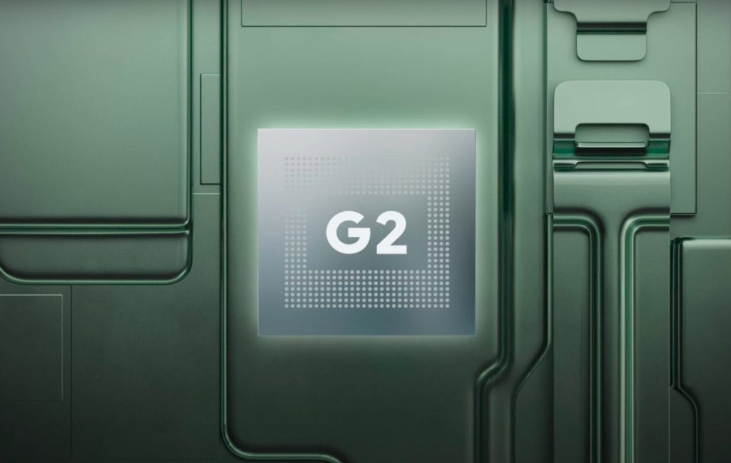
The biggest improvement is not hype. It is control.
That sounds less dramatic than realism, but in practice it matters more. Teams do not just need images that look good. They need images that obey.
Better Prompt Adherence
This is where a lot of weak models fall apart.
You write a detailed brief. You explain the subject, style, lighting, framing, mood, color palette, and composition. A weaker tool grabs a few ideas and improvises the rest. That may be fine for experiments. It is not fine for real production.
GPT Image 2 feels stronger because it holds onto more of the brief.
That changes the workflow in a big way. The prompt becomes a real creative input, not just a suggestion. You can ask for structure. You can ask for visual discipline. You can ask for fine details that normally get lost. And the output is more likely to stay on track.
That makes the model more useful for teams who care about speed, but also care about getting things right.
Stronger Multilingual Text Rendering
This part matters more than many people realize.
For years, image generation worked best in English and other Latin-based languages. Once you moved into Chinese, Japanese, Korean, Hindi, or other scripts, the quality often dropped. The image might still look polished, but the text inside it looked wrong, awkward, or broken.
That is a serious limitation.
In modern design, language is not just added at the end. It is part of the visual itself. Posters, explainers, charts, comics, app graphics, and social assets all depend on text being readable and visually coherent.
For teams exploring gpt-image-2, this is one of the most important upgrades. Better multilingual understanding means the model is more useful for global campaigns, localized content, and regional creative work.
It is not just about translation.
It is about design integrity.
If the language looks wrong, the image feels wrong. A tool that handles multilingual text better becomes far more practical in the real world.
Better Style Fidelity
Style has always been one of the most frustrating parts of AI image generation.
You ask for something cinematic, and get something vaguely dramatic. You ask for pixel art, and get a softened version of it. You ask for comic-book energy, and end up with a generic digital illustration.
Close is not enough.
Creative teams need outputs that actually respect the requested visual language. That means texture, lighting, composition, and detail all need to line up. If they do not, the image loses its edge.
GPT Image 2 seems better at staying loyal to a requested style instead of drifting into a safe middle ground. That matters for concept art, marketing visuals, storyboard work, and branded content. It means teams spend less time correcting the vibe and more time improving the actual idea.
Why 2K-Ready Output Matters
Resolution is not everything.
But low-utility images create friction fast.
If the output cannot hold up in a presentation, product page, campaign draft, or social asset, it becomes another rough sketch. Someone still has to rebuild it. Someone still has to fix the weak spots. The time savings disappear.
That is why 2K-ready output matters. It pushes AI images closer to something teams can really work with. Not perfect. Not always final. But strong enough to move deeper into the pipeline before human cleanup becomes necessary.
That is the real value.
Not magic.
Not novelty.
Momentum.
Where GPT Image 2 Is Most Useful
Different teams will use it in different ways, but a few use cases stand out.
| Use Case | Why It Matters |
| Marketing creative | Faster concept testing for ads, banners, and campaign visuals |
| Product storytelling | Better lifestyle scenes, explainers, and feature-led graphics |
| Social content | More adaptable visuals for different sizes and placements |
| Educational graphics | Clearer visuals for explainers, charts, and multilingual content |
| Concept exploration | Faster comparison of multiple visual directions |
This is where the model starts earning its place.
It helps people get from blank page to visible option faster. It helps teams test more ideas without drowning in revisions. It helps creative work move.
How to Get Better Results
A better model still needs a better brief.
That part never changes.
1. Be specific
Do not ask for “a nice visual.” Say what is in the frame. Say what matters most. Say what must stay visible.
2. Define the style clearly
If you want cinematic, explain what kind. If you want polished, say whether that means premium, minimal, bold, playful, or editorial.
3. Think about format early
A wide banner and a mobile story do not behave the same way. If the final asset has a destination, mention it in the prompt.
4. Treat text as structure
If the image needs labels, icons, UI blocks, or non-English copy, make that clear from the start. These are not minor details. They shape the whole composition.
Final Thoughts
AI image generation is growing up.
That is the real story here.
The market no longer needs more tools that look amazing in demos and fall apart during production. It needs models that can take direction, preserve detail, respect style, and create visuals that are actually usable.
That is why gpt image 2 feels important.
It moves the conversation away from “Can AI make cool images?” and toward a better question: “Can AI make images that teams can really use?”
That is a much harder standard.
It is also the standard that matters.