

LiveGap Charts is an AI chart maker and data visualization tool that turns raw data or natural language into interactive charts instantly.
The “Empty Canvas” problem—the technical and psychological barrier of starting a visualization from scratch—is a major bottleneck in data storytelling. In 2026, LiveGap Charts is breaking this barrier by integrating LLMs directly into the creative process via OpenAPI 3.1. This shifts the workflow from manual data entry to “Intent-Based Design,” allowing users to move from raw data to a professional draft in seconds.
The Problem: The High Tax of Technical Literacy
Traditional graphing tools require users to navigate hundreds of toggles and complex UI menus. This creates a “Technical Tax” for professionals who need quick trend analysis but aren’t data scientists. In a fast-paced environment, manual CSV formatting and axis configuration are simply too slow.
The Solution: Instant Visualization with “Human-in-the-Loop” Control
LiveGap Charts uses AI to handle the “Draft Phase” by automatically mapping data, selecting the appropriate chart type, and applying smart styling. However, the real strength lies in the live, interactive workspace it generates. When an AI Agent calls the LiveGap API, it produces a unique URL that opens a fully populated, high-functioning editor.
The Workflow in Action: From Prompt to Professional Chart
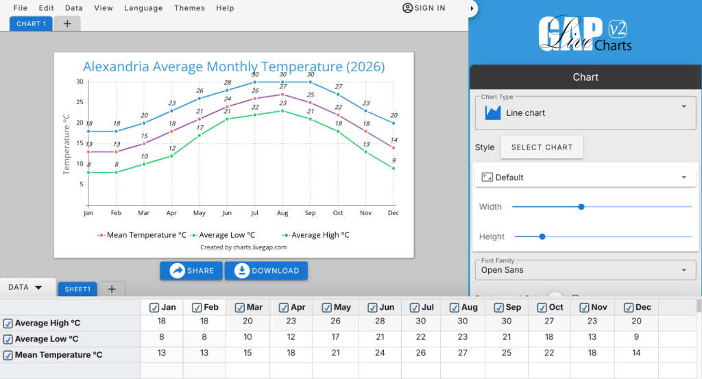
Imagine asking an AI like Gemini or ChatGPT for local climate data.
The Prompt: “Create a line chart showing the average monthly temperature in Alexandria for 2026, including highs, lows, and the mean.”
The Execution: The AI uses the LiveGap OpenAPI schema to map this request into a functional URL.
The Result: A single link opens the LiveGap V2 editor with everything pre-configured:
View the Alexandria 2026 Temperature Chart Example
The Advantage: Interactive Exploration & Precision
Once the link is opened, the user has full creative and analytical control. Unlike a static image, the LiveGap interface allows you to:
- Deep-Dive Comparisons: Users can instantly hide or show specific rows and columns to isolate variables and explain the data more clearly.
- Total Customization: Fine-tune the colors, switch templates, or change the entire visual style to match a brand.
- Professional Export: Save the final result as a high-resolution PNG, scalable SVG, or even a video animation for social media and presentations.
The Blueprint for AI-Native Charting
Developers can use this System Prompt to instruct their AI Agents:
The LiveGap AI Prompt:
“You are a Livegap Charts AI generator. Use the Livegap OpenAPI specification as the source of truth for all chart formats: https://charts.livegap.com/openapi.yaml. Convert natural language requests into a valid Livegap Charts URL. Infer chart type, extract titles and labels. Return ONLY the valid URL—no explanation.”
The Future: Self-Service Analytics
This democratization allows any user to speak to their data in their native tongue—supported by LiveGap’s 30-language strategy—and receive a world-class visual in return. By removing the friction of the “how,” we finally give users the freedom to focus on the “why”.