



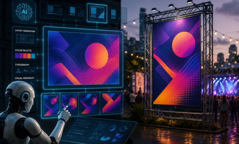
When you organize a big outdoor community event, street fair, or open market, you have to handle many different jobs at the exact same time. On one side, your team needs to manage ground safety—arranging food stalls, running temporary power cables, setting up sound equipment, and keeping emergency paths open. On the other hand, making the event successful depends a lot on clear visual landmarks, happy visitors, and easy navigation across the entire location. Because guiding thousands of moving visitors across a big park or open parking lot needs fast visual clarity, small handwritten notes or basic manual print designs fail to catch crowd attention properly.
Today, event organizers use artificial intelligence and spatial analytics more and more to improve venue layouts before printing physical banners. By using AI layout software, planners look at foot-traffic heatmaps, viewing angles, and crowd movement paths to design banners that get maximum attention. When guests arrive at a new venue looking for check-in desks, parking areas, or medical tents, clear directional signs prevent crowd confusion and reduce stress for everyone. Regional event planning guides tested by localized print service networks like AlphaGraphics Brentwood show that combining AI-optimized visual layouts with strong physical signage is the best way to keep foot traffic moving smoothly and improve venue safety.
Leveraging AI for Environmental Material Selection and Durability
Designing good large-format prints means you must match physical banner materials with real outdoor weather conditions. AI design programs now combine local weather data and exposure models to help managers choose the right materials based on sun exposure, wind speed, and humidity forecasts.
To make sure your event signs stay strong against harsh outdoor weather, check material specs using three main points:
- Wind Resistance Factor: Solid vinyl banners work like sails when strong wind hits them, which can pull metal grommets right off temporary fences. AI structural tools suggest using mesh banner material with small holes, so strong winds pass through safely without tearing your printed graphic.
- Weatherproof Barrier Protection: Regular paper signs get ruined fast under morning humidity or unexpected rain showers. Using heavy PVC vinyl or hard corrugated plastic (Coroplast) boards keeps your high-contrast text clean and readable during sudden weather changes.
- Anti-Glare Surface Coating: Direct sunlight reflecting off shiny plastic signs creates a harsh glare that stops people from reading from far away. Choosing a matte or satin finish keeps your letters easy to read from different sun angles all day long.
AI-Assisted Design Rules for Distance Readability and Color Contrast
AI layout tools use vision algorithms to simulate how human eyes read visual text from different distances. When visitors scan a crowded field looking for directions, they should not stop walking or squint their eyes to read long sentences.
Implementing the AI-Calibrated Ten-Foot Rule
Vision test studies show that every single inch of letter height gives about ten feet of clear visual reading distance. AI layout software automatically calculates required font sizes using estimated viewing distance:
| Viewing Distance | Minimum Font Height | Primary Signage Application |
| 30 Feet Away | 3 Inches | Table displays, booth banners, check-in tents |
| 50 Feet Away | 5 Inches | Walkway arrows, food area headers, restroom signs |
| 100+ Feet Away | 10 to 12 Inches | Main entrance gates, roadside banners, parking markers |
Optimizing High-Contrast Visual Palettes
AI design tools check color contrast levels under different natural light conditions. Avoid soft pastel shades or low-contrast pairings like yellow text on white backgrounds. AI systems always recommend high-contrast color pairs used by highway traffic boards—like black text on bright yellow, white letters on dark navy blue, or dark green writing on clean white backgrounds—to give maximum readability for moving crowds.
Structuring an AI-Modeled Chronological Wayfinding Chain
A common mistake in regular event planning is placing big signs at final destination spots while forgetting the paths that lead people there. AI foot-traffic models help event managers build a continuous visual wayfinding chain that connects a visitor’s arrival point to their final destination.
| Sequence Stage | Signage Type | Primary Purpose |
| 1. Roadside Approach | Large Roadside Banner | Shows main street turn-off point to approaching drivers early |
| 2. Parking Transition | Field Directional Arrows | Guides cars safely away from busy walking paths |
| 3. Orientation Hub | Vertical Site Layout Map | Helps guests plan their walking path before entering crowded areas |
| 4. Point of Service | High-Visibility Header Signage | Shows food stalls, medical tents, and help desks above standing lines |
To build a smooth navigation path across your venue grounds, place your large-format prints in this logical order:
- The Roadside Approach: Hang your largest banner right at the main street turning point so drivers see it early and slow down safely.
- The Parking Transition: Put clear arrow signs at car turning points inside the parking field to separate vehicles from walking guests.
- The Main Orientation Hub: Set up a large vertical map board near the entry gates so visitors plan their walking route before joining the crowd.
- The Point-of-Service Markers: Hang high-visibility signs right above food stalls, first aid tents, and help counters so they stay visible over standing lines.
Safe Installation Protocols and Visual Consistency
Large banners are heavy physical items; bad mounting work causes safety problems. Modern event platforms use system checklists to check hanging hardware safety, ensuring setups hold up against wind and environmental strain.
Securing Hanging Hardware for Large Banners
When attaching soft vinyl prints to chain-link fencing or metal frames, do not use weak packing tape or thin rope that stretches out. Heavy-duty nylon zip ties or strong bungee cords with metal hooks keep banner surfaces flat, tight, and neat. Pulling the fabric evenly from all four corners prevents wrinkles that mess up your text.
Ground-Anchoring Standalone Signs
For directional lawn signs along grass paths, use long steel wire frames or wooden stakes pushed deep into the dirt. Loose plastic signs fall over during sudden wind gusts, turning arrow pointers the wrong way and confusing your guests.
Maintaining Brand Uniformity Across Physical and Digital Touchpoints
Modern event guests expect a matching experience where physical signs look like digital event apps and online maps. If physical banners use different names than your online schedule, visitors get confused easily.
Before sending design files to the print shop, check all text wording through a single check list. Make sure terms like “Information Desk,” “Help Tent,” and “Registration Desk” stay exactly the same across all digital maps, printed banners, and directional signs. Also, put simple standard icons next to text—like a big question mark for help desks or a medical cross symbol for first aid tents. Combining AI-assisted design planning with reliable commercial print services makes sure your community event stays safe, well-organized, and clear from start to finish.