
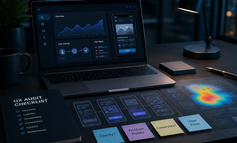
Redesigns fail quietly. A team senses something is wrong, new screens get approved, and six months later the metrics look the same as before. What was missing at the start was a UX audit, a review of where real users stall and what that costs the business.
Strong UX/UI design services start with one before a single screen gets drawn, and the same review run in-house gives your redesign a scope, a ranked problem list, and a number to beat.

Set the Audit Scope Around One Business Problem
Start with the metric that prompted the redesign conversation. Falling activation, checkout abandonment, renewal drops, support volume concentrated on one feature. Write the scope as something testable, like “users abandon between shipping and payment,” which gives every later finding somewhere to attach.
Short conversations with product, support, and sales come next. Fifteen minutes each is enough to surface where people disagree about what is broken, and that disagreement is far easier to handle now than during the final readout.
Then decide what stays out. A review covering the whole product returns shallow observations across forty screens, and a review covering three flows returns evidence someone can act on.
Pull Analytics and Support Data Before Reviewing Any Screen
Numbers show where people leave, and recorded behavior with support history explains what pushed them out. Gathering both before you open the interface keeps the audit anchored to what customers did, since reviewing screens early tends to lock you into your own reading of them.
Five sources cover most products:
- Funnel data for drop-off rates at each step of the flow you scoped
- Session replays filtered to sessions that ended in abandonment
- Heatmaps and click maps showing what people reach for and what they never see
- Support tickets grouped by feature, to find the complaints that repeat
- Recent survey responses, read for the words customers use to describe the problem
Pay attention to disagreement between sources. A feature with clean funnel numbers and heavy ticket volume usually hides a problem your analytics cannot see.
Map the User Flows That Carry the Most Revenue
Write out every screen a customer passes through from entry to completed goal, for the two or three flows tied to money. Onboarding, activation, checkout, renewal.
The map earns its keep twice over. Heuristic findings and test tasks both need a fixed reference point, and numbered steps give them one, so “step 4 of 7” replaces a screenshot with an arrow drawn on it.
Mapping also exposes something teams rarely catch on their own. Flows built around internal logic, like how the database is organized or which team owns which screen, stop matching how customers move. Those mismatches show up as extra steps nobody has questioned in two years.
Run a Heuristic Evaluation Across Every Screen in Scope
Check each mapped screen against an established set of usability principles, most commonly Jakob Nielsen’s ten heuristics. Log every violation with the screen it appears on, the principle it breaks, and the evidence behind it.
Wording decides how findings land. Compare two entries for the same problem:
“The sign-up button placement is wrong and the form needs a redesign.”
“Clicking Create account produces no visible feedback, so the screen reads as frozen until the next page loads.”
The second gives a developer something to fix and gives a stakeholder nothing to argue with. Keep judgment out of the log and put observable behavior in its place.
Coverage improves with reviewers. Nielsen’s own project data put a single evaluator at around 35 percent of the usability problems in an interface, which is why three to five reviewers working independently is the standard recommendation when budget allows.
Test the Same Tasks With People Outside the Building

Give five to eight people the tasks from your flow map and watch them without helping. Internal reviewers carry product knowledge customers do not have, and friction invisible in a review meeting shows up within thirty seconds to a stranger.
Recruit for the audience you scoped
Participants should match the customers behind your metric. A B2B admin panel needs admins, and testing it with general users produces feedback you cannot use.
Assign outcomes, not clicks
“Add a teammate and give them billing access” gives you behavior. “Click Settings, then Members, then Invite” gives you a demo of your own navigation.
Record hesitation, wording, and abandonment
Note where people pause, what they expect the next screen to show, and which step they give up on. The words participants use describing their confusion end up being the most persuasive material in your final report.
Check Accessibility and Load Performance in the Same Pass
Both fall outside standard design review, and both can cancel out design fixes that look correct on their own.
Run the screens in scope against WCAG criteria, covering contrast ratios, keyboard navigation, visible focus states, and form labeling. Pull Core Web Vitals for the same screens.
Sequencing is the reason to do this now. Rebuilding a form for speed when it still fails keyboard navigation produces a faster form that some customers still cannot complete, and the second round of fixes costs more than the first would have.
Record What Customers Already Complete Without Trouble
Keep a second list running next to your problem log. Every pattern people move through without hesitation goes on it, including the ones nobody has ever complimented.
Redesigns break these constantly, because no one wrote them down and the new interface had no reason to protect them.
The keep list also answers the question leadership asks after every readout, which is how much of the product needs rebuilding at all. Evidence that four flows out of seven perform well changes the size and the price of the project.
Rank Findings by User Impact and Build Effort
A log of forty problems in no particular order gets read once and shelved. Score each finding on two axes and sort by the result.
| Finding | Severity | Users affected | Build effort | Sequence |
| No feedback state after sign-up submit | High | All new accounts | Low | 1 |
| Billing permissions buried three levels deep | Medium | Admins only | Low | 2 |
| Checkout requires account creation | High | All buyers | High | 3 |
| Inconsistent icon labels in the sidebar | Low | All users | Medium | 4 |
Sorting turns the log into a decision about scope. When the top entries are cheap to build and cover most of the lost conversion, the redesign gets narrower, and sometimes it stops being a redesign.
Hand the Audit Over as the Redesign Brief

The audit ends when three items reach the design team. Your ranked list sets what gets fixed and in what order, the keep list marks what stays untouched, and the current numbers on the metric you scoped at the start set the bar the new design has to clear.
That third one gets skipped most. Capture task completion rate, drop-off, or time on task before anything ships. Without it, nobody can prove afterward that the redesign helped.