
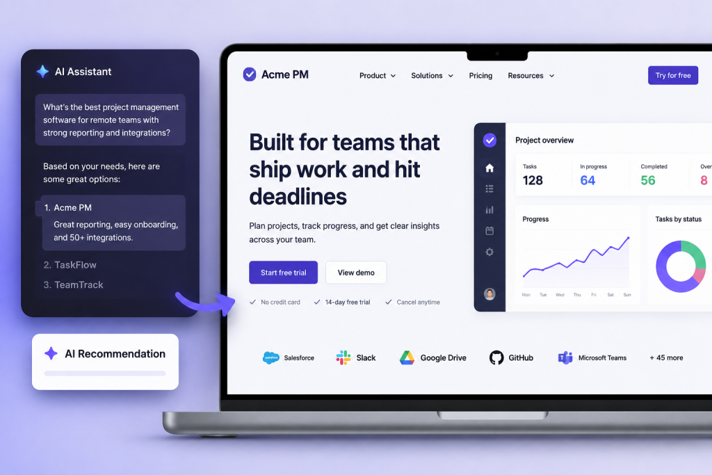
A buyer asks an AI tool for project management software with strong reporting, simple onboarding, and integrations for a remote team.
Your product appears in the answer. A few seconds later, that buyer lands on your website and sees a broad headline about transforming the way teams work. The page looks polished, but it says little about reporting, onboarding, or integrations.
The recommendation created interest. The website lost it. SaaS companies are spending more time thinking about how they appear in AI generated answers. That work matters, but discovery is only one part of the journey. Once someone clicks through, the site has to confirm that the recommendation made sense.
AI referrals arrive with expectations
Visitors from a traditional search result may still be learning the category. They might read a guide, compare several approaches, and slowly work out what they need.
Someone arriving from an AI recommendation often has a narrower question. They may already know why the product was suggested and want to check whether it fits their team.
That buyer isn’t looking for another vague category explanation. They want clear answers.
Does the product handle the workflow they described? Can it connect with the tools they already use? Is it built for a company of their size? What does the experience look like once they sign up?
A page that answers those questions quickly feels reassuring. A page filled with broad claims makes the recommendation feel less credible.
Match the page to the reason behind the visit
AI tools can recommend the same product for several different reasons.
One buyer might care about automation. Another may need better client reporting. A third could be trying to replace a complicated product that nobody on the team enjoys using.
Sending all three visitors to the same general homepage puts too much pressure on one page. The message has to stay broad enough for everyone, which often leaves it useful to nobody in particular.
Dedicated pages can do a better job. They give companies room to explain a specific use case, show the relevant workflow, answer likely objections, and offer a sensible next step.
The wording matters too. If AI systems and customer review sites describe your product as a reporting tool, while your own site talks almost entirely about productivity, the buyer has to bridge that gap alone. Most won’t spend long trying.
Let buyers see the workflow
Screenshots can show that a feature exists. They don’t always show how someone would use it. Imagine a buyer who wants to know how a report is created. A row of interface images may show the dashboard, filters, and export button, but the visitor still has to piece the process together.
A short guided experience can make the answer much clearer. SaaS teams can use an AI guided demo experience to walk visitors through a selected workflow and respond to common questions without forcing them to wait for a scheduled sales call.
The strongest demos stay narrow. Showing how to build one report or complete one setup task is usually more helpful than recreating the entire product inside the website. Buyers need enough detail to judge the fit, not a tour of every menu.
Live sales demos still have a place, especially for larger purchases with complex requirements. But they shouldn’t be the only way to understand the product.
Make sure machines can read the same page buyers see
Many SaaS websites depend heavily on JavaScript. That can create a gap between what appears in a browser and what a crawler can access without running every script correctly.
A human visitor may see a detailed product page with pricing, use cases, and customer examples. A crawler may receive a thinner version or wait too long for the content to load.
That matters because AI recommendation systems often rely on information collected from search indexes and other public sources. If key pages are difficult to render, the product may be described using incomplete or older information.
Prerender helps JavaScript websites provide rendered versions of their pages to crawlers. It doesn’t replace clear writing, useful page structure, or strong product information. It helps make sure those details are available to the systems trying to read them.
Technical access and human clarity work together. Fixing one while ignoring the other still leaves a weak journey.
Give the buyer more than one next step
A visitor referred by AI may be close to buying, or they may only be checking whether the recommendation was sensible.
A single “Book a demo” button assumes too much. Some visitors will want pricing. Others will look for documentation, security details, integration pages, or a customer story from a similar company. A few may want to explore the product before sharing their email address with anyone.
The page should make those paths easy to find without turning into a crowded wall of buttons. One clear primary action, supported by a few relevant options, is usually enough.
AI tools may shape the shortlist, but the website still has to earn the buyer’s confidence. Clear language, accessible pages, focused product education, and sensible next steps give the recommendation somewhere useful to land.