
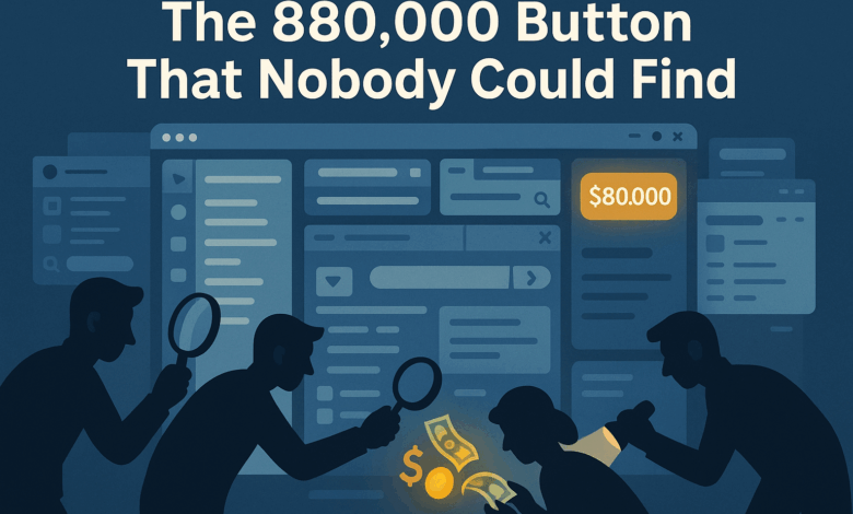
Sarah almost threw her laptop out the window last Thursday.
Not because it was broken. Because she’d just discovered that her company’s “sophisticated” checkout process was so confusing that customers were abandoning $80,000 worth of sales every single day. The buy button was there. It was functional. It just looked like decorative text.
Three months of arguing with their designer about “aesthetic choices” while money walked out the door.
This isn’t some startup horror stories. This is a profitable SaaS company with 50 employees and venture backing. Smart people making dumb interface decisions.
And it’s happening everywhere.
The Designer vs. The Dollar
I love designers. Creative people, great aesthetic sense, passionate about their craft. Also completely disconnected from business reality half the time.
Last month I’m reviewing this beautiful e-commerce site. Gorgeous typography, perfect color harmony, layouts that belong in a design museum. The designer had won awards for it.
Know what else it won? A 73% cart abandonment rate.
Why? The product images were so “artistically integrated” with the background that customers couldn’t tell what they were actually buying. The price was displayed in a font so elegant it was basically hieroglyphics. The add-to-cart button was a subtle gradient that whispered instead of shouted.
Beautiful. Useless.
The conversation with their designer went something like this:
“But making the buttons more prominent would ruin the visual balance!”
“You know what ruins visual balance? Going out of business.”
When Pretty Becomes Expensive
Here’s something that shocked me when I started tracking this stuff. Companies spend massive amounts making their interfaces look amazing, then lose massive amounts because nobody can use them.
Take this medical software company. They hired a top-tier design agency. Spent six months and $200,000 creating this stunning interface for doctors to input patient data.
Looked incredible in the demo. Clean, modern, exactly what you’d expect from a Silicon Valley health tech startup.
Then actual doctors tried using it.
Disaster.
Turns out, doctors don’t have time to hunt for buttons or figure out clever navigation patterns. They need big, obvious controls they can hit while distracted, stressed, and possibly wearing gloves.
The beautiful, minimalist interface slowed them down so much that several clinics stopped using the software entirely.
Six months later, they redesigned everything. Bigger buttons, clearer labels, more obvious workflows. Less pretty, infinitely more functional.
The Mobile Disaster Everyone Ignores
Pull out your phone right now. Go to your company’s website. Try to complete whatever your main business goal is – buy something, sign up, contact you.
How’d that go?
I’ll bet it was annoying. Maybe you had to zoom in to read text. Maybe buttons were too small to tap accurately. Maybe the whole experience felt like trying to thread a needle while wearing mittens.
Here’s what kills me: most companies know their mobile experience sucks. They just don’t think it matters because “our customers are professionals who use desktops.”
Wrong.
Even B2B customers browse on mobile first. They find your company on their phone during lunch, bookmark it, then maybe come back on desktop later. If the mobile experience is terrible, there is no later.
I proved this to a skeptical CEO by showing him their analytics. 67% of first-time visitors came from mobile. Of those, 89% never returned.
His beautiful desktop-optimized site was bleeding potential customers before they even had a chance to see it properly.
The Psychology of Clicking Things
Users are lazy. Not stupid, just lazy. And impatient. And easily confused.
They’re not going to study your interface like it’s a piece of art. They’re going to scan it for about 2.3 seconds, looking for something that solves their immediate problem.
If they can’t find it instantly, they leave.
This drives designers crazy because they want people to appreciate the thoughtful details, the subtle interactions, the carefully considered information hierarchy.
But users don’t care about your information hierarchy. They care about getting stuff done.
I watched someone spend 20 minutes trying to cancel their subscription on a beautifully designed settings page. The cancel button was there – hidden under “Advanced Options” in a dropdown menu labeled “Account Preferences.”
Why? Because the designer thought cancellation was a “power user feature” that shouldn’t clutter the main interface.
Twenty minutes. For a button click.
The Audit That Saved Christmas (Literally)
Retail client calls me in November. Panic mode. Their holiday sales are down 40% from last year despite more traffic than ever.
“Must be the economy,” says the marketing director.
“Maybe our products aren’t competitive,” suggests the product manager.
I spend two hours watching real customers try to use their site. The problem becomes obvious immediately.
Their shopping cart was broken. Not technically broken – it worked fine. But it was invisible. They’d designed it to “integrate seamlessly with the overall aesthetic.” It looked like a decorative icon.
People were adding items to their cart, then couldn’t figure out how to buy them. They’d click around for a few minutes, get frustrated, and leave.
Simple fix: made the cart button look like a cart button. Big, obvious, with a number showing how many items were inside.
Sales increased 156% in the first week.
Sometimes the best design is the most obvious design.
What Good UI Actually Looks Like
Want to know my favorite interface? Amazon’s checkout process.
Is it beautiful? Not really. Is it effective? Absolutely.
One-click buying. Clear pricing. Obvious next steps. No artistic interpretation required.
Amazon could make their site gorgeous. They have unlimited resources and access to the world’s best designers. Instead, they optimize for conversion.
Because pretty doesn’t pay the bills. Usable does.
Finding the Right UI Partner
Most companies need outside help with interface design. Not because their internal teams are incompetent, but because they’re too close to their own products.
When you work with something every day, you forget how confusing it is for newcomers. You develop muscle memory for weird workflows. You stop seeing the obvious problems.
The right partner will spend more time understanding your users than admiring your brand guidelines. They’ll ask uncomfortable questions about why certain features exist and whether anyone actually uses them.
Good user interface audit work isn’t about making things prettier. It’s about making them work better.
The Real Cost of Bad UI
Bad interfaces don’t just lose sales. They create support tickets, frustrate employees, and damage brand reputation.
Every confused user is a potential negative review. Every abandoned cart is lost revenue. Every support call about “how do I…” is money down the drain.
But here’s the thing about UI problems: they’re usually easy to fix once you identify them. Moving a button, changing some text, adjusting a color – small changes with big impacts.
Sarah’s company? They moved their buy button to a more prominent location and changed the color from subtle gray to obvious blue. Sales increased 23% overnight.
Eighty thousand dollars a day was the difference between gray and blue.
Makes you wonder what other expensive mistakes are hiding in plain sight on your website.