When designing for AR and VR, it very quickly becomes clear that everything going on behind the interface is far more difficult than the interface itself. Ready or not, spatial UX forces you to embrace the fact that the world becomes your canvas. The lighting changes, the objects move, colors clash, and the shadows change. And users don’t pause their environments just because your UI wants to be seen.
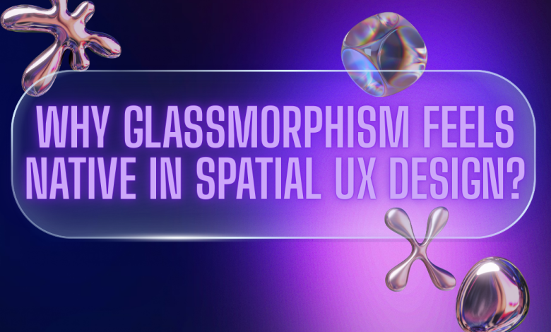
Flat interfaces can’t survive that kind of unpredictability. That’s why glassmorphism-what many people initially treated as a passing 2D aesthetic-has become so essential in immersive design. According, Victor Churchill, a seasoned UX designer, glass finally behaves the way we always wanted it to on mobile screens: as a living, lightweight material that can exist in space without fighting for dominance.
And once you start designing with glass inside of a 3D environment, it’s hard to imagine spatial UX without it, Churchill adds.
Glassmorphism is increasingly being seen as a foundational design language for the future of UX. To explore this shift in greater depth, we invited Victor Churchill to share his perspective on why glass feels so natural in spatial experiences. Victor explains:
Why Glass Feels Natural in Spatial Experiences
One of the biggest misconceptions in spatial design is that the UI exists in front of the environment. The opposite is true, the environment swallows the interface. Anything you build must contend with real surfaces, textures, movement, and noise.
Opaque panels seldom pass this test: they are too heavy, commandeering attention, and they steal from the user environmental awareness, which is particularly unsafe in training, field work, and multitasking scenarios. In spatial computing, losing sight of your surroundings doesn’t just break immersion-it breaks trust.
Glassmorphism works in spatial experiences because it respects the user’s environment instead of attempting to overpower it. It harmonizes with what is already there, rather than making the world dim or disappear. The material retains enough transparency for users to remain aware of their physical surroundings while offering just enough opacity to keep text stable and readable. It also adds a subtle depth to make the interface feel actually present in the room-but not overwhelming or intrusive.
What makes this method work is the respect it pays to the user’s task. The interface doesn’t demand to be front and center; it doesn’t scream for attention. Instead, it whispers its way into the scene, like a pane of intelligent glass hovered in place. It’s there without being in the way, intentionally present without beating you over the head, and assisting without being intrusive. That is to say, glassmorphism lets the interface support the experience instead of overshadowing it.
When designers describe spatial UX as “a dance between digital and physical,” glass is what keeps the choreography graceful.
Glass as a Working Material, Not a Decorative Motif
Glassmorphism first gained attention in 2D interfaces because of its aesthetic appeal, but in AR and VR it transforms into something far more structural, almost architectural. Instead of serving as a visual embellishment, it behaves like a functional material with a clear purpose in the spatial environment.One of its most crucial functions is blur, which becomes the UI’s main defense mechanism rather than just a stylistic choice. A workbench covered in tools, an engine block full of metal parts, cluttered signage, thick foliage, or coworkers moving through the scene are examples of chaotic backgrounds found in real life. To keep text, icons, and diagrams readable without overpowering the surroundings, blur reduces this visual noise.
Transparency plays an equally critical role. In hands-on AR workflows, Users must interact with digital guidance while keeping a clear view of actual objects, tools, and surfaces in hands-on augmented reality workflows. A completely solid interface becomes a safety concern rather than just an annoyance because opaque panels can easily hide hazards or obscure important details. Glass-like transparency maintains both the physical context and situational awareness.
The shape and feel of the UI also matter. Sharp, rigid edges look unnatural when suspended in 3D space, often breaking immersion by reminding users that the interface is artificial. Soft edges, however, visually “settle” into the environment. They reduce the sticker-like effect that plagues many AR overlays and help the UI appear more like an integrated surface floating naturally within the scene.
The UI’s spatial credibility is further strengthened by depth cues. Subtle drop shadows, gentle refractions, and volumetric light hints inform the user about the location of the interface, its distance from actual objects, and what elements are interactive. Without these cues, UI elements may feel disembodied or disconnected, floating in space without a connection to the outside world. Glassmorphism behaves like a familiar real-world material that our brains already know how to interpret, so it gracefully fills in these perceptual gaps.
How AR and VR Push Glassmorphism Further Than Any 2D Medium Ever Could
 The rise of spatial computing didn’t just revive glassmorphism—it gave it purpose.
AR environments introduce real-world unpredictability. VR environments introduce artificial depth and motion. Both demand interfaces that feel physically plausible.
Glassmorphism answers questions that other UI materials simply cannot:
- How do we show information without covering something important?
- How do we keep the UI present without suffocating the environment?
- How do we maintain depth perception when placing UI in mid-air?
- How do we communicate hierarchy without traditional screen constraints?
The more mixed and multimodal our interfaces become, the more essential this material becomes.Glass provides those overlays with a place that doesn’t overpower the user’s field of vision, especially as AI superimposes information over actual objects, such as labels, directions, hazard warnings, and step-by-step instructions.
It takes on the role of an impartial mediator between the real world, digital overlays, and human vision.
Case Study: AR Engine Repair Trainer (2023)
A personal observation from my 2023 AR design project.
When I was working on an AR engine repair trainer last year, I encountered the limitations of traditional spatial UI firsthand. The interface had to guide learners through repair steps while they were physically interacting with the engine. Every time a UI panel blocked a bolt, a nut, or a connector, the experience broke.
We eventually shifted to a glassmorphic system for most of the interface:
- translucent instruction cards floating just off the engine block,
- anchored callouts pointing gently to components without overshadowing them,
- a semi-transparent progress tracker fixed to the user’s peripheral view,
- and adaptive blur that intensified only when backgrounds became visually dense.
It was the first time I saw glassmorphism behave like a real, useful tool.
Users could read instructions and still keep the engine in sight. Their eyes stopped darting around. Their hands moved more confidently. Steps flowed faster. And perhaps most importantly, the interface stopped feeling like a layer added on top—it behaved like it belonged there.
That “belonging” is the real magic of glass in spatial UX.
Patterns That Keep Glassmorphic UI Effective in 3D Space
After working through several spatial workflows, certain interface patterns repeatedly proved their value in maintaining clarity and usability. One of the most dependable techniques has been the use of translucent instruction cards. These surfaces present information clearly while still allowing the background to remain visible, striking a balance between guidance and environmental awareness. In a similar way, floating anchor labels help identify or describe specific objects without overwhelming them. They appear to “stick” to components just enough to feel helpful, yet never dominate the user’s field of view.
Menus in spatial environments benefit from a lighter touch as well. Instead of feeling like traditional panels that interrupt the scene, the most effective menus behave almost like part of the air—present when needed, but never heavy or intrusive.This feeling of weightlessness becomes all the more effective when the adaptive opacity and blur are applied in tandem. In the same way that real glass focuses or dims its clarity with respect to light sources and depth, so too should the UI subtly shift given what is happening in the environment: clearer during busy scenes, softer when the background is quiet.
Soft volumetric shadows also play a quiet but important role. Even a faint shadow below a hovering surface helps the user understand its position in space, giving the interface a sense of grounding without adding visual clutter. Across all these patterns, there is one underlying philosophy shared: humility. Glass-based UI works precisely because it does not try to compete with the world it lives in. Instead, it supports the experience by blending into the environment and allowing the user’s attention to stay rooted in the task at hand.
The Future of Spatial Interface Materials
As spatial computing continues to evolve and AI becomes an intuitive part of daily workflows, the role of the interface will change dramatically. Rather than a dominant visual layer, the UI needs to exist in a state where it’s always available but very rarely intrusive-present enough to guide the user, yet subtle enough to fade into the background when not needed. Glassmorphism fits this emerging requirement almost intuitively because it sits so comfortably at the intersection of material and transparency; it behaves like something tangible but never heavy, noticeable but never demanding.
Going forward, spatial interfaces will have to fluidly adapt to real-world conditions such as lighting, depth, and motion. They have to scale intelligently with the complexity of the user’s task, providing more support when the situation gets demanding and easing off when cognitive load is low. They need to float in comfort within the environment, not drawing too much attention to themselves, while still carrying the intelligence of AI-driven prompts, labels, and insights. It is here that glassmorphic surfaces excel at striking this balance: guidance without clutter, presence without interruption.
Over time, glassmorphism will become less of a stylistic choice and more of its own material language—one that isn’t anchored to the idea of a “screen” at all, but to the way humans naturally perceive objects in real space. Once UI stops behaving like a flat panel and starts behaving like a surface that lives within the environment, the perception of glassmorphism as a trend will fade. It will simply be the natural posture of spatial interfaces, the visual grammar that makes digital information feel like it belongs in the world instead of sitting on top of it.
Conclusion: A Material for the Next Interface Era
Spatial computing forces a complete re-think of what UI even is. No longer is it a flat surface, but it becomes something that breathes in a user’s environment as it adjusts to depth, light, movement, and context.
Glassmorphism succeeds here by knowing the rules of the real world. It gets out of the user’s way when it needs to. It steps forward when clarity matters. It adapts without demanding attention. Moreover, Glass is the balancing material in this space, where physical action must coexist with digital information. It gives a respectful home to digital guidance: floating, present, quietly intelligent.
To sum up, the future of spatial UX isn’t about adding more interfaces.It’s about choosing the right material for the world it enters. And at this moment, glass is the material that understands that world best.