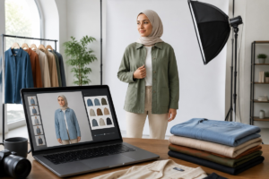
Color variants are a quiet production bottleneck in ecommerce. AI can help, but only when teams treat it as a controlled product-content workflow rather than a one-click novelty.

Every online retailer knows the moment when a simple merchandising decision becomes a production problem: the shirt that sold well in black now needs images in navy, cream, olive, and burgundy. The cut is the same. The model is the same. The product page is the same. Yet the team still has to choose between another shoot, a retouching queue, late samples, or publishing the new variant with weaker imagery.
That is where AI clothes color changers are becoming useful. They do not replace photography standards, merchandising judgment, or honest product representation. They remove a narrow but expensive bottleneck: creating credible color-variant images when the garment shape, pose, and composition already work. Used with review controls, the technology can help ecommerce teams test colorways, refresh listings faster, and reduce near-identical reshoots.
The key phrase is used with review controls. A clothing color edit can look simple: change a red jacket to blue and call it done. In retail, the image has to preserve fabric texture, seams, shadows, trim, buttons, and the rest of the scene. It also has to avoid misleading the customer. The best workflow is not “click and publish.” It is “use AI where it is reliable, then check the output like a product asset.”
Why color variants create so much hidden work
Color expansion is one of the easiest ways for apparel brands to increase SKU depth without designing a new silhouette. A hoodie can become six variants. A dress that performed well in one seasonal palette can be tested in another. A marketplace seller can respond to trend colors without rebuilding the whole product page. The business case is straightforward, but the content workflow often lags behind the merchandising plan.
Traditional product photography is built around control: samples, steaming, lighting, model or mannequin shots, retouching, export, naming, and upload. That control still matters for hero launches, luxury pages, and products where exact color is a major selling point. The pain starts when the team needs a set of near-identical variants for an item that has already been photographed well. The real cost is coordination: late samples, unavailable models, repeated lighting setups, and retouching queues filled with repetitive work.
What an AI clothes color changer actually does
An AI clothes color changer takes an existing apparel photo and changes the visible color of a selected garment while preserving the surrounding image. In practice, the tool has to understand where the clothing begins and ends, how folds behave, where shadows fall, and which parts of the photo should remain untouched. Better tools are not applying a flat overlay. They try to keep texture, lighting, and edges believable.
For teams testing this workflow, AIClothSwap is one practical place to start. The main product is built around changing clothing in photos, while the AIClothSwap clothes color changer focuses specifically on color changes instead of forcing the user into a broad image-editing suite. That specialization matters because apparel images have their own failure modes: missed cuffs, color spill on hands, flattened knit texture, odd halos around hair, or logos that accidentally take on the garment color.
Where AI fits in a retail image workflow
The safest place for AI color changes is between creative production and final catalog approval. Start with a clean source photo: good lighting, visible garment boundaries, minimal motion blur, and a pose that already works for the product page. The AI tool generates color options. Then a human reviewer checks whether each output is accurate enough for its commercial use.
Source selection matters more than teams expect. Do not begin with the prettiest lifestyle shot if the garment is partly hidden by a bag, hair, hand, or harsh shadow. A front-facing studio shot, mannequin image, or clean model photo usually performs better than a crowded editorial scene. AI can handle some complexity, but ecommerce teams should not make the model solve problems that a better source photo would avoid.
The palette should also come from product data, not from memory. If the brand uses fabric swatches, Pantone references, internal color names, or supplier specs, those references belong in the brief. “Make it blue” is too vague when the SKU is midnight navy, cobalt, or washed denim. Generate one variant at a time, keep the base image consistent, and name files so they map back to the catalog, such as productid_color_view_version.
Finally, review outputs in the same context where customers will see them. A color may look convincing at full size on a designer’s monitor but show edge artifacts on a mobile product card. A shade that looks balanced on a white background may feel too saturated beside other variants in a carousel. Check thumbnail size, product page size, and zoomed detail before treating the file as ready.
A practical five-step process

A simple process keeps the technology useful without letting it become chaotic. First, pick a source image with clean lighting and clear garment boundaries. Second, prepare the color list from product data. Third, generate one variant per intended SKU. Fourth, run visual QA against fabric texture, edges, shadows, logos, trim, buttons, and color spill on skin or background. Fifth, store approved files with names that map back to the product catalog.
Teams that need a more tactical walkthrough can use a step-by-step clothes color change guide as support material. The important point is to turn the edit into a repeatable operating procedure. A good output is not just a nice-looking picture; it is an asset that has to survive handoff to merchandising, product upload, paid ads, and customer support.
When AI is a good substitute for a reshoot

AI color editing works best when the product already has a strong base image and the intended change is mostly color, not structure. A T-shirt changing from black to forest green is a strong use case. A hoodie changing from beige to burgundy can work if fabric folds are visible and the background is simple. A dress shown in multiple seasonal colors is also a natural fit when the silhouette remains identical across variants.
It is also useful for pre-production testing. Before committing to a full shoot, a brand can create preview assets for internal review, buyer presentations, landing page mockups, or ad concepts. These images should be labeled appropriately if they are not final product photography, but they help teams decide which colors deserve production investment.
Catalog maintenance is another strong case. Retailers often have older pages where one variant image looks dated beside newer photography. If the base composition is still acceptable, AI can help create a more consistent set without pulling the product back into a studio queue. For a lean team, that can be the difference between refreshing a page this week and letting a weak image sit for another season.
When a real reshoot is still the better choice
There are clear limits. If the fabric itself changes, a color edit can be misleading. Black velvet, white linen, metallic satin, and ribbed knit do not reflect light in the same way. A color changer can preserve some texture from the original image, but it cannot capture how a different material behaves in the real world. If the variant uses a different fabric, weave, finish, or transparency level, a reshoot is usually safer.
A reshoot is also better when color accuracy is central to the purchase: bridalwear, uniforms, luxury apparel, team merchandise, or color-matched accessories. In these cases, a small mismatch can create returns, support tickets, or trust issues. AI can help with internal previews, but final customer-facing images should be checked against the physical product. Complex patterns also need caution. Plaid, embroidery, gradients, sequins, lace, sheer fabric, reflective trim, and all-over prints give AI more chances to damage detail near seams or folds.
The QA checklist that matters
A short checklist catches most issues before they reach the product page. Start with edges: sleeves, collars, hems, waistbands, hair overlap, fingers, and accessories. Then check texture: ribbing, weave, wrinkles, shine, and transparency. Next, check shadows and highlights. A new color should still respond to the original lighting instead of looking pasted onto the garment.
After that, check non-garment areas. Skin, background, buttons, labels, zippers, logos, jewelry, and props should not pick up the new color unless they are part of the garment. Finally, compare the output with the actual SKU reference. Warm ivory should not drift toward yellow. Charcoal should not read as pure black on mobile.
The reviewer should match the risk. A designer may notice edge artifacts. A merchandiser may notice the wrong shade. A marketplace operator may notice a listing requirement. Customer support may know which colors historically trigger complaints. AI image workflows work best when they shorten repetitive work, not when they remove every human checkpoint.
How to keep the workflow honest
The commercial risk is not that AI changes a color. Retouchers have adjusted colors for years. The risk is publishing an image that customers reasonably interpret as a faithful product photo when it is actually a speculative visualization. Retailers should define where AI color variants are allowed, how they are labeled in asset systems, who approves them, and when physical sample verification is required.
Those rules can stay simple. AI-generated color variants might be allowed for low-risk basics, internal testing, and ad concepts, but require merchandising approval before publication. High-risk categories might require a swatch comparison. Premium launches might still use full studio photography. The review level should match the buying risk.
A useful internal rule is to separate preview assets from publishable assets. Preview assets can support planning, buyer conversations, ad concepts, and layout tests. Publishable assets need stricter checks: physical SKU confirmation, catalog naming, marketplace compliance, and approval from the person responsible for merchandising accuracy. This distinction lets teams use AI early without pretending every generated image is automatically ready for customers.
What this means for smaller ecommerce teams
Large retailers can absorb extra shoots more easily than small teams. A smaller seller may not have a studio relationship, an in-house retoucher, or enough margin to reshoot every new color. For them, this kind of editing tool can be a practical bridge. It lets the team improve listing consistency and test color demand without treating every variant as a full production event.
That does not mean the technology should be casual. The brands that benefit most will build discipline around it: good source photos, clear color references, consistent naming, visual QA, and a decision tree for when to reshoot. If a team only needs to change shirt color in photo for a low-risk preview, AI may be enough. If the goal is to change color of clothes for a final catalog image, the output still needs merchandising review. And if the broader task is to change clothes in photo rather than recolor the same garment, the team should treat it as a different workflow with different risks.
For online retailers, the promise of AI clothing color tools is not magic. It is speed with control. Photography still provides truth; AI provides scale; human review decides which output is ready for customers.